FAQs & Tips

 (Japanese text only)

  • AppleはMシリーズにおいて、ユーザーがシステム設定内から Apple ディスプレイの ICC プロファイルを設定する機能の仕様変更を行いました。

    プロファイルを変更するか、工場出荷時のデフォルトに戻すためには、以下の手順をご参照ください。

    (MacBook Pro M1, macOS Ventura 13.5.1 環境下による検証)

    1.「アプリケーション」 > 「ユーティリティ」>「ColorSyncユーティリティ.app」を開きます。

    2. 左側に表示されている「装置」> サイドバーから「ディスプレイ」 > から対象となるディスプレイを表示します。

    3. 「カラーLCD」がMacの内蔵ディスプレイを指します。

    4. 右側にプロファイルの情報が表示されます。

    4. プロファイルを「出荷時の設定」に戻すには、右側の「現在のプロファイル」の横にある下向き矢印をクリックし、「出荷時の設定に設定する」を選択します。

    5. 「出荷時の設定に設定する」のオプションは、プロファイルをモニターの標準システムプロファイルに設定します。

    6. 「その他」を選択すると、ホームのライブラリ/ColorSync/プロファイル フォルダで利用可能なすべてのプロファイルが一覧表示されます。 リスト内のプロファイルのいずれかを選択すると、それが現在のプロファイルとして設定されます。

    7. Apple 以外のディスプレイはこの影響を受けず、プロファイルは引き続きシステム設定内で設定できます。

  • Please find the following link for a comparison chart of the technical specifications of the three newest models.

    Click Here

  • ColorChecker Chart(カラーチェッカー チャート)は、非常に耐光性の高い着色剤で製造されていますが、どの着色剤も絶対的な耐光性はありません。

    チャートに明るい光が恒常的に当たらないようにして、使用しないときは黒いカバーに入れて保管してください。

    また、カラーパッチ部分に直接触れたり傷が付かないように留意し、ほこりや高温多湿・化学物質の煙などから保護できるよう慎重な取り扱いをおこなってください。

    使用環境の変化や使用状況にもよりますが、経年劣化による影響と正しい色の識別と一貫性を保つため、カラーチェッカー チャートは約2年を目安に交換することをお勧めします。

  • macOS Montereyバージョン12.xでは、ディスプレイ環境設定のデザインが変更されました。キャリブレーション時に表示に影響を与えないよう、キャリブレーションのプロセスを開始する前に以下のポイントをご留意ください。

    A. スクリーンセーバの設定

    キャリブレーションの途中でスクリーンセーバーが起動しないよう設定をします。

    システム環境設定 > デスクトップとスクリーンセーバ > 「スクリーンセーバを表示」のチェックを外す。

    B. バッテリーの設定

    キャリブレーション時のバッテリーの電力供給の減少やスリープにならないようにするため、極力電源アダプターからの電源供給を行なってください。

    (デスクトップの場合は表示が異なる場合があります)

    システム環境設定 > 「バッテリー」または「電源アダプター」

    1. 左側「電源アダプタ」を選択 > 「ディスプレイをオフにする」 > 1時間後に設定。

    2. 「ディスプレイがオフのときにMacを自動でスリープさせない」のチェックを入れる。

    3. 「ネットワークアクセスによるスリープ解除」にチェックを入れる。

    C. ディスプレイの設定

    自動調節機能による変化をしないようにします。

    システム環境設定 > ディスプレイ > 「輝度を自動調整」と「True Tone」のチェックを外す。

    AからCの変更をした設定は、キャリブレーションの結果の確認後に戻していただいて構いません。

  • XDRディスプレイを搭載した新しいM1 MacBook Proのシステムでは、Appleはユーザーがシステム環境設定内から ICC プロファイルを設定する機能を削除しました。その代わりに、 カスタマイズ可能なディスプレイプリセットが用意され、ディスプレイの全体的なキャリブレーションができるようになりました。

    しかし、Caribrite 社製品および旧 X-Rite 製品を使用したプロファイリングによって改善することができます。

    ColorChecker Profiler および ColorChecker は、M1 MacBook Pro の内蔵ディスプレイ用のプロファイルを作成することができます。

    ここでは、内蔵 XDR ディスプレイ のプロファイルを正しく作成・設定する方法と、ColorChecker アプリケーションの設定方法について説明します。

    プリセットのプリファレンスを設定する。

    以下の手順で、ワークフローに最適なディスプレイの「プリセット」を設定してください。

    1.システム環境設定を開き「ディスプレイ」を選択します。

    「プリセット」のドロップダウンから「プリセットのカスタマイズ」を選択し、「+」アイコンをクリックしま す。すると、新しいプリセットのオプションが表示されます。

    2.プリセットに適切な名前を付けます。

    「色域」で「P3」を選択します。 ※これは、ディスプレイのネイティブな色域です。

    3.「ホワイトポイント」ドロップダウンで、希望のホワイトポイントを選択します。

    ※通常、写真編集には D65 が最適です。

    ※これら 2,3 の設定は、ColorChecker アプリケーションでプロファイルを実行する際に使用する設定と同じにする必要があります。

  • 以下のCalibrite Webのリンクをご参照ください。

    Adobe Lightroomでのカメラプロファイルの使用

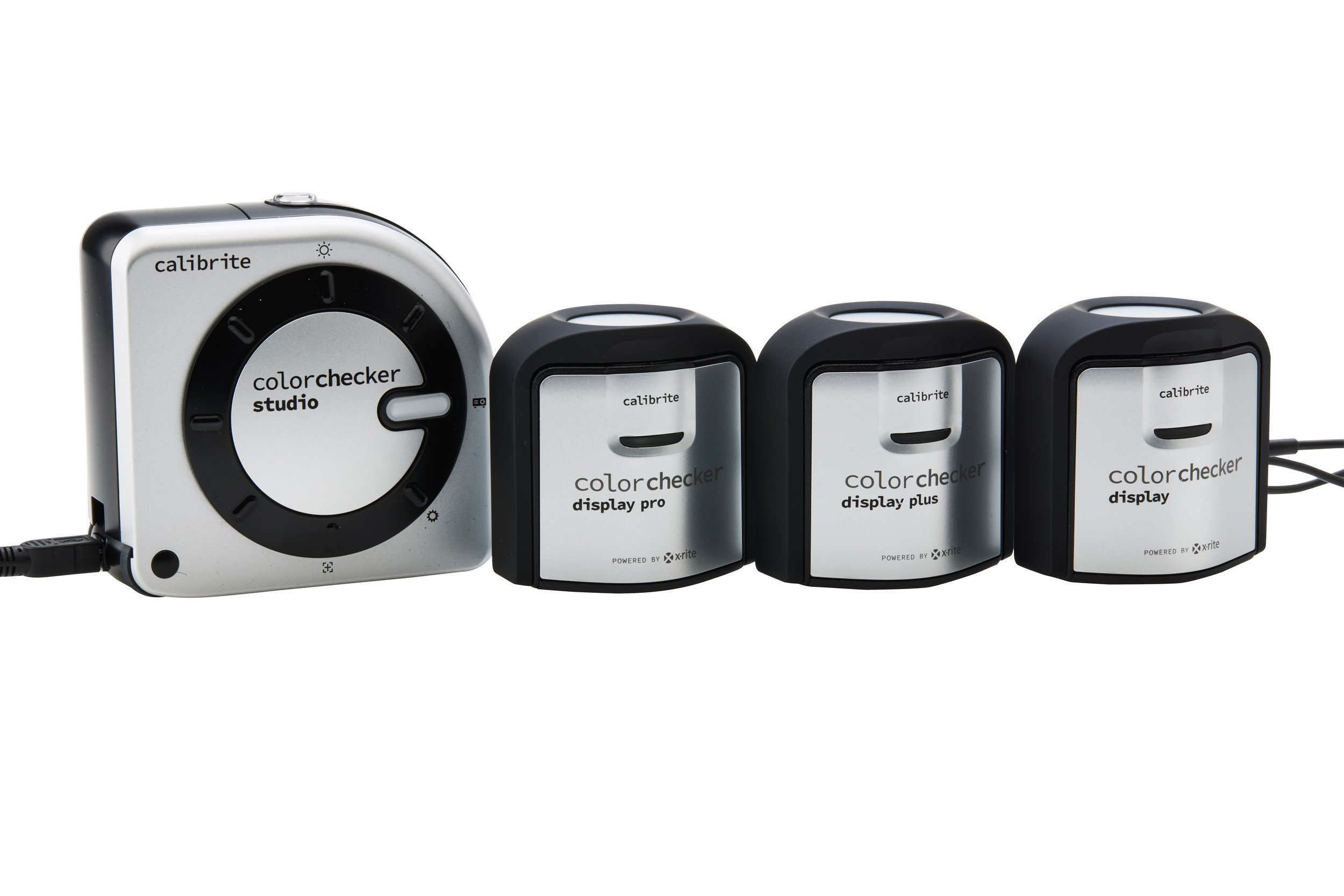
Calibrite Product Comparison Chart

 (Please Click or Tap the icon. Japanese text only.)


動画の再生言語は英語ですが、画面の下部にあるギアマークで字幕を選択し自動翻訳により日本語を選択する機能もあります。(再生する機器やOSや通信環境、サービス事由により提供されない場合もあります)


Product Review

EIZO Certified ColorEdge Ambassador "mycolorsp" reviewed Calibrite PROFILER.  Please check it out.

Calibrite PROFILER Review

EIZO Certified ColorEdge Ambassador "mycolorsp" reviewed the Calibrite ColorChecker series!

The mycolorsp website contains valuable articles on color management based on a wealth of experience and a high level of expertise.

Calibrite ColorChecker Series Review


Links

The Color Management Practice Blog by Hirama Photo Retouching Office provides valuable information based on their wealth of experience, from the basics of color management to peripheral equipment.

We have received permission to introduce this article on our website.

Color Management Practice Blog


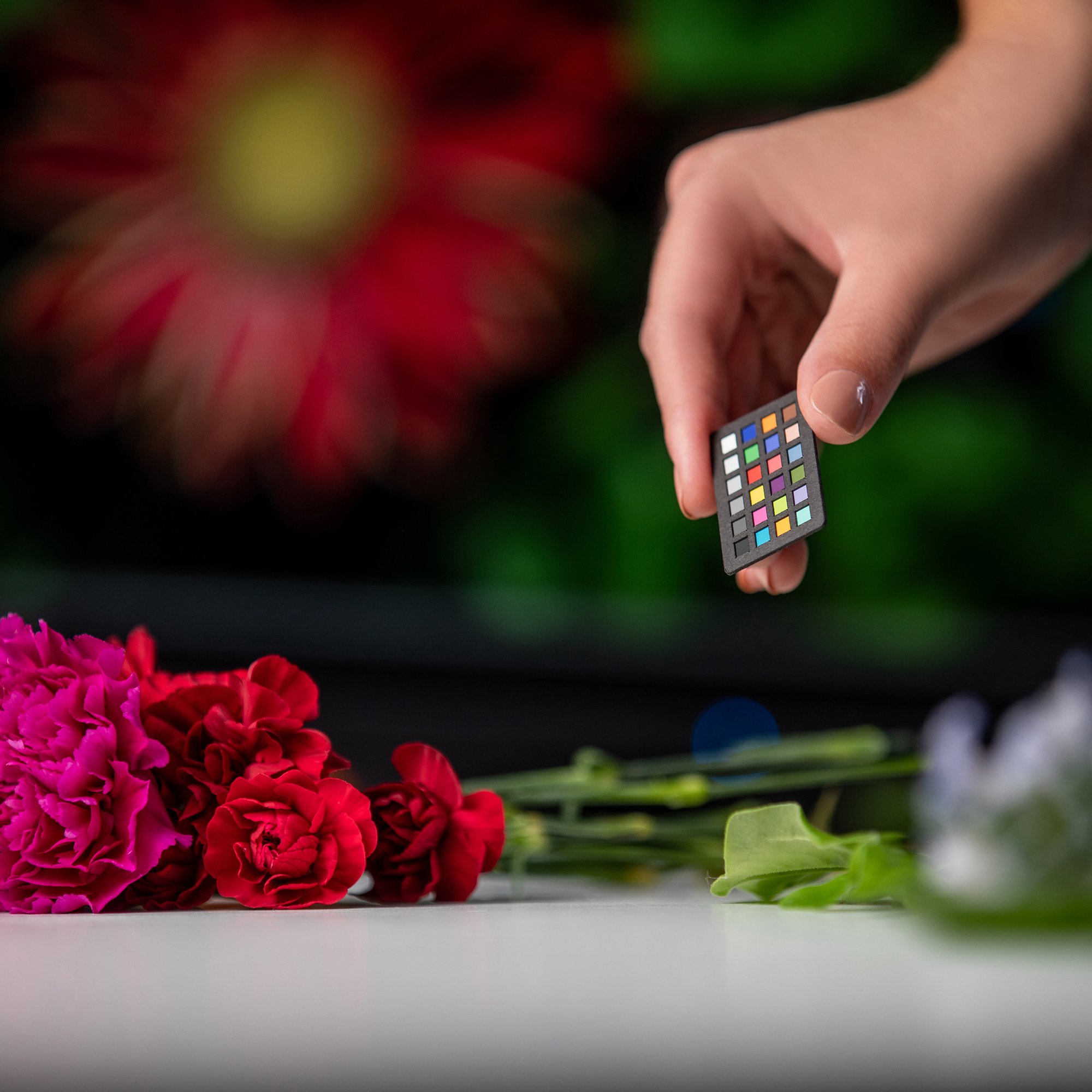
The Calibrite ColorChecker series uses in professional shooting scenes around the world.

  • “I like to describe my photography as clean, vibrant, and timeless. I love natural and true colors while combining proper posing and most importantly people’s emotions.”

    - Yaneck Wasiek, Calibrite Ambassador

  • “We spend an inordinate amount of time and money on the capture and processing side of our craft. Ultimately, however, we view the fruit of our work as a print or a slide show or on the web.

    It is critical to ensure that what I have spent time and money on to process, looks the same way in print or on the web and there is only one way to guarantee this and that is with Color Management.”

    - Seth Resnick, Calibrite Ambassador

  • "If you have no idea if your colors are accurate, how can you possibly hope that others will see your images the same way you do?

    Calibration is a key first step in perfecting your artistic vision.”

    - Don Komarechka, Calibrite Ambassador

  • “Working with accurate color in a creative workflow is extremely crucial it saves time and resources. Although sometimes re-edit is inevitable it is always great to have the color looking as close as possible to the final product.

    This way the re-adjustments will be minor or go away altogether.”

    - Art Suwansang, Calibrite Ambassador

  • “Color management is a fundamental part of my workflow.

    I want people to see what I see. Not only is it important for images for print and web but also when shooting food and products for commercial its even more important that the colors are accurate.”

    - Solli Kanani, Calibrite Ambassador

  • “Whether I am working with clients or for myself, I don’t have time to waste. Ensuring the color I capture in camera is accurately represented across all the devices in my workflow is essential so that I know that what I am editing is what I will be sharing or printing. I consistently profile my laptop, desktop and my favorite printer/paper combinations so that I don’t worry and have plenty of time to focus on the creative stuff that brings me so much joy.”

    - Alan Shapiro, Calibrite Ambassador

  • “Colour management is the essential element that makes all my imagery stand out from the competition, time and time again I look at images and the skin tone is off or the room is too cold. To me colour management is the foundation of any photographer and filmmaker.”

    - Ross Grieve, Calibrite Ambassador

  • “To understand various concepts such as Color Management, Color Collection, and Color Grading and to effectively utilize them in works, it is necessary to build a highly reliable environment and maintain awareness.

    The harmony of consistent colors completes the story of the precious moment of truth.”

    - vincero